Case study · Campaign
Not mytype
A communication campaign to destigmatise type 1 diabetes. It doesn't shout. It interrupts.
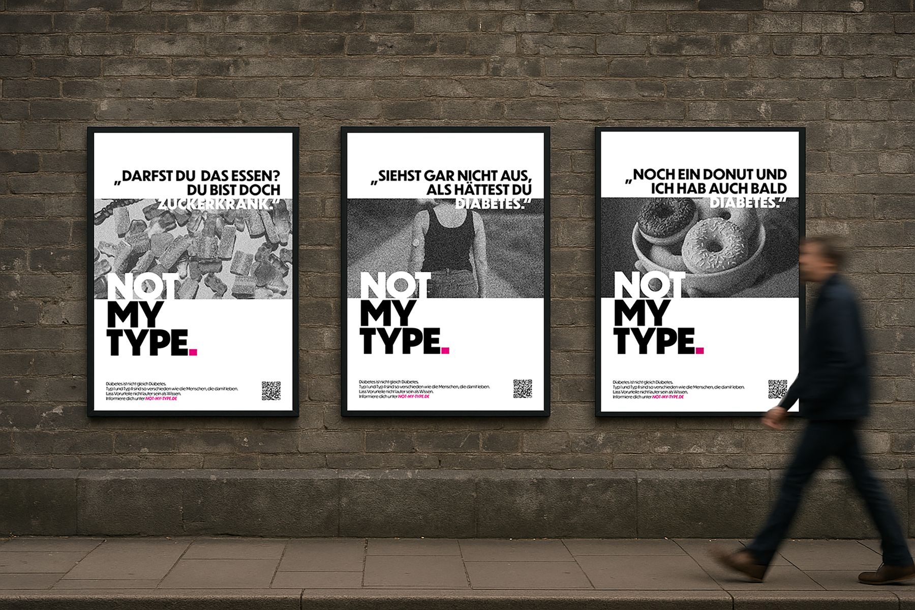
Not My Type. is a behavioural-psychology-grounded communication campaign built to dismantle a quiet, everyday form of harm: the casual confusion of type 1 and type 2 diabetes — and the stereotypes that confusion drags with it.
- Discipline
- Brand strategy, campaign design, behavioural communication
- Deliverables
- OOH poster series, campaign website, social media system, three short-form videos, full campaign briefing, merchandising
- Research base
- Daniel Kahneman's two-systems model, peer-reviewed stigma research (Brazeau et al., 2018), competitive campaign analysis, original survey (70 respondents), two qualitative in-depth interviews
- Claim
- NOT MY TYPE.
- Context
- Bachelor's thesis, Communication and Product Design, HTW Dresden, 2025 · supervised by Prof. Dr. Florian Alexander Schmidt and Prof. Diana Simon
The problem
Type 1 diabetes is an autoimmune disease. The immune system destroys the insulin-producing cells in the pancreas. It is not caused by diet, lifestyle, or weight. It cannot be cured, reversed, or trained away. People with type 1 inject insulin every day for the rest of their lives.
None of that is what the public hears. In public perception, “diabetes” is one thing — typically type 2, typically framed as self-inflicted. The conflation isn't pedantic; it has measurable consequences. Peer-reviewed research by Brazeau et al. (2018) found that 65.5% of adolescents and young adults with type 1 diabetes report stigma-related experiences, and stigmatised patients carry more than double the risk of poor glycaemic control and nearly double the risk of severe hypoglycaemia.
Stigma is not a feeling. It is a clinical risk factor.
The campaign brief, then: change how people talk about type 1 — because how people talk shapes how patients treat themselves.
Research foundation
The research phase was deliberately heavy. A communication campaign about a deeply misunderstood medical condition cannot rest on intuition.
Competitive campaign analysis
Three reference campaigns: Medtronic's #BlueBalloonChallenge (developed by MadeBrave) — strong on metaphor and participation, weak on type differentiation; Helmholtz/GPPAD's K1DS ARE HEROES — strong visual presence, but top-down and superhero-coded in a way that creates distance; and Abbott's #DiabetesStigma / Let's Change Perspective — sharp on language sensitivity but conspicuously avoiding the type 1 / type 2 distinction, which, given the brief, reinforces exactly the stereotype it claims to address. The gap was clear: nothing in the existing landscape was differentiating type while also activating reflection.
Behavioural psychology
The campaign's theoretical spine is Daniel Kahneman's two-systems model from Thinking, Fast and Slow. Stereotypes are System 1 phenomena — fast, automatic, associative. They form through repetition and feel like truth because they feel familiar. System 2 — slow, deliberate, effortful — only activates when something contradicts the world-model System 1 maintains. So the design problem isn't “communicate facts.” It's “engineer cognitive friction.” A campaign that wants to break a stereotype has to first interrupt the automatic reading.
Original empirical research
An online survey (70 respondents, structured into separate question paths for affected and non-affected participants) and two semi-structured qualitative interviews — Angelina (16, school context) and Tom (24, university and sport context). The survey produced quantitative measures of stigma frequency among type 1 patients (the statement “someone confuses type 1 with type 2” scored a 4.57/5 average) and mapped which communication formats non-affected respondents found most likely to shift their thinking: personal stories, visual metaphors, social media. The interviews added texture: how stigma actually shows up in classrooms, in changing rooms, on courts.
First concept — and why it was killed
The first concept was built around the metaphor of the shadow — survey-validated as resonant, psychologically loadable (Plato's cave, Jung's shadow work), and visually rich. Posters explored the shadow as a constant companion: not enemy, not foreign body, but integrated self. The aesthetic moved away from typical advertising gloss toward something quieter and more atmospheric.
It looked good. It tested well emotionally. And then it was cut.
The problem only surfaced under critical review: the shadow metaphor was too universal. It described the experience of any chronic illness. It had no specific anchor to type 1, no friction with the type 1 / type 2 confusion that was the entire reason for the campaign. Returning to the Kahneman framework: the shadow created emotional resonance, but no System 2 trigger. It explained. It didn't interrupt. And without interruption, stereotypes stay where they are.
Scrapping a concept that was already eight weeks deep, that was beautiful, that worked on the surface — because it wasn't doing the actual strategic job — turned out, in retrospect, to be the most important part of the project.
The pivot: language as material
The second concept started from a different observation. Stereotypes about type 1 don't usually arrive as images. They arrive as sentences.
- “Are you even allowed to eat that?”
- “You probably had too much sugar as a kid.”
- “So much sugar, I'm going to get diabetes.”
- “But you don't look diabetic.”
These are the small, recurring acts of misrecognition that, repeated, become the public understanding of the disease. So the campaign's material became language itself: quoted sentences, things actually said to people with type 1, pulled out of context, set in serious typography, paired with a single response.
The claim emerged from a wordplay that does several jobs at once:
One phrase, three layers, one strategically loaded full stop. Not my type. Diabetes is not the same as diabetes. A familiar phrase, lifted into an unfamiliar context, generates exactly the cognitive dissonance Kahneman's model requires to make a stereotype reviewable.
Design system
Visual reduction as strategic position
The category default in health awareness campaigns is loudness — saturated colour, urgent imagery, emotional appeals. Not My Type. moves in the opposite direction. The reduction isn't aesthetic preference; it's a strategic claim. When the content of the message is a misuse of language, the design has to let that language breathe. White space is where reflection happens.
Typography
Dunbar Tall is used across the entire system. Tall, narrow, present without being aggressive — it carries authority for the medical content while staying contemporary enough for a young audience. The single typeface across every touchpoint creates instant recognition.
Colour
Black and white throughout, with one strategic exception: a magenta full stop after NOT MY TYPE. The period — the punctuation of finality — becomes the loudest element on the poster. Urgent, but not catastrophic. Not red, not warning. A signal, not an alarm.
Photography
Black-and-white, digitally noised. The interference pattern reads at two levels: it functions visually as a hook (the eye stops on it because it looks wrong), and it acts as a metaphor for the cognitive interference the message is trying to create. The static is the System 1 / System 2 friction made literal.
The poster mechanic
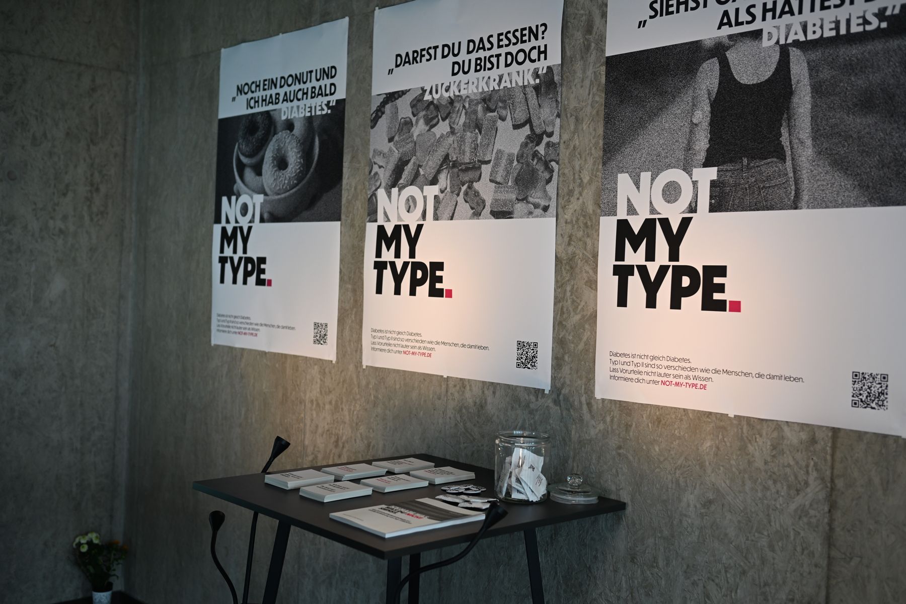
Each poster pairs a quoted stereotype — “Are you even allowed to eat that?” — with the campaign response NOT MY TYPE. A small information block clarifies the difference between type 1 and type 2; a QR code routes to the campaign website for deeper engagement.
Real-world testing
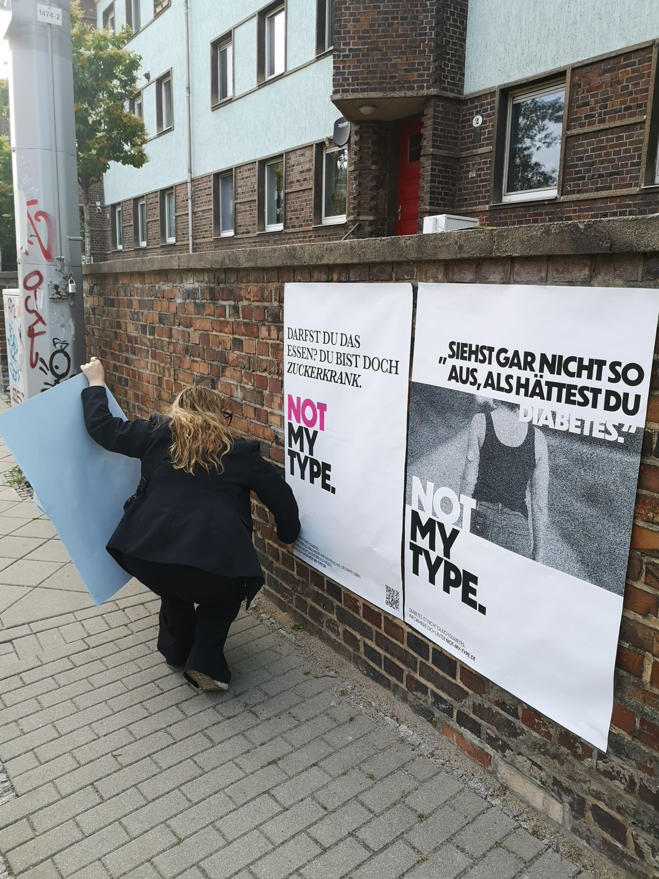
Four final variants were printed at A0 and guerrilla-tested in public space — bus stops, utility boxes, walls — to evaluate legibility, hierarchy, and recognition at distance. The tests changed the final design: legibility needed more support, which led to the introduction of the magenta accent on the typographically-led variant. The colour decision was empirical, not stylistic.
Campaign architecture
The campaign was built as a connected system rather than a single artefact.
Out-of-home posters
The primary medium. Designed to operate as interventions in everyday space — placed where people don't expect education to find them. Multiple motifs were developed, allowing rotation across the campaign run.
Short-form video
Three social-media videos extend the poster logic into motion. Each shows a realistic everyday scene in which a stereotyped comment is made about type 1 diabetes. At the moment the comment lands, the image and audio glitch — the same “interference” aesthetic from the posters. NOT MY TYPE. resolves the disruption. Scenarios are drawn from real situations reported by interview participants and survey respondents.
Campaign website
The central hub. It holds the educational content (type 1 vs type 2, the research, the stigma data), surfaces the posters and videos, and invites participation — visitors can submit their own quoted stereotypes, share statements, and pass the campaign forward.
Social media strategy
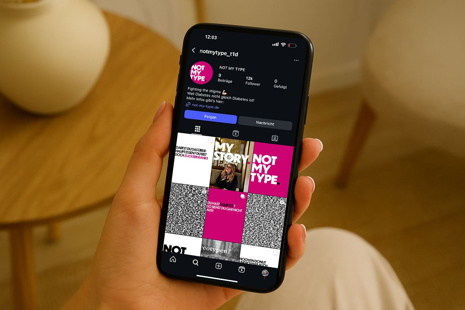
A complete content design system for Instagram and TikTok: feed posts, carousels, story templates, and Reels, all working within the same typographic and tonal system. The format mix is deliberate — educational carousels for retention, Reels for reach, story formats for community participation, and explicit space for affected people to speak in their own voice.
Campaign briefing
The final deliverable is a complete campaign briefing document — the bridge between thesis and real-world implementation.
Personal stake
I have lived with type 1 diabetes for roughly twenty years. I have heard every sentence on every poster in real life, often more than once. This is part of why the project exists. It is also why I treated the research phase with the seriousness I did — because lived experience is a starting point for relevance, not a substitute for evidence.
If destigmatisation is a marathon, Not My Type. is one well-engineered kilometre of it.
Concept, strategy and design: Charlotte Kliem
Get involved
Your
story
Do you live with diabetes, or research, write or design around it? Write to us.
Newsletter
Coming
soon
Want to be part of it? Register your interest.